Layered, Not Loaded: A Practical Christmas Window Plan for Independent Shops
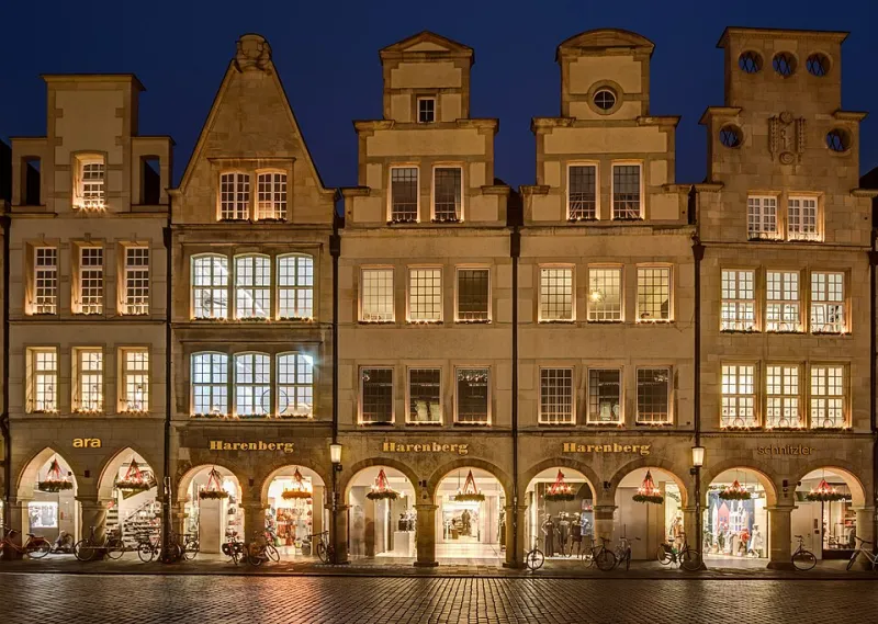
Photo: Dietmar Rabich, CC BY-SA 4.0, via Wikimedia Commons
The tub comes down from the loft around bonfire night. Someone's mum drops off a garland. There's a box of baubles that still smells faintly of 2019. By the first week of December the window holds a snowman, four handwritten A4 offers, a warm-white string, a multicoloured string, and a small real tree nobody can water because it's behind the display.
None of that is a failure of taste. It's a failure of sequence. Christmas arrives at an independent shop in dozens of small, well-meant deliveries, and each one gets added to the glass because there's nowhere else to put it. By mid-December the shopfront has become a collage of everyone's good intentions, and the one thing a customer needs — a reason to come in — is somewhere in the middle of it, at knee height.
Here's the order of work that actually helps.
Decide the one job before you touch the tinsel
A festive window is usually asked to do three jobs at once: say we're open and Christmassy, say what to buy, and still look like the shop people already like. Pick a lead.
A gift shop on a market square is selling browsing — the window should feel like the first aisle, not a poster for a sale. A café is selling warmth and the fact you're open on the days nobody else is. A hardware shop is selling reassurance: batteries, extension leads, a spare bulb, and yes, we're here until four.
Write that job on a Post-it and stick it inside the frame where only staff can see it. Everything else in the window is decoration. Decoration is very welcome. It just doesn't get to be the loudest element.
Three layers, in this order
Base. The backdrop. Paper, fabric, painted board, whatever's already in the stockroom. Its only real job is to set contrast for everything in front of it. Dark backdrop, lighter stock. Light backdrop, darker stock. If what you sell is already a riot of colour — sweets, books, wool, houseplants — go quiet and pale behind it so the colour reads as product rather than noise.
Story. The thing at the centre, at roughly eye height for an adult, around 1.5 metres back from the pavement. One hero product, one scene, one tree with a single decent set of lights. Not five small vignettes competing across 1.2 metres of glass.
Sign. One message. Extended opening hours genuinely are news in December, but they belong on one clean panel, not scattered across three handwritten sheets. If you must list offers, a single board with a maximum of three lines will be read. A lattice of A4 will be admired for its commitment and quietly ignored.
Light is the whole trick
Most independent windows are underlit, and the fix is cheaper than a new display. Two or three warm-white sources (around 2700K — the colour of a normal bulb, not an operating theatre) aimed across the display rather than straight out at the street will do more than another bag of baubles. Cool white daylight bulbs make food look grey and skin look ill; warm light makes almost everything look like it costs slightly more.
Test it from the pavement, at night, with the shop lights on. That's the only view that counts. If you can't tell what the hero object is from four metres away in the dark, neither can anyone walking past at 5pm.
Say one thing on the glass
Give yourself a rule: if it has to be taped to the window, it has to earn the space. One line, readable from across the road, in a size that a person in a hurry can absorb. Everything else — the small print, the allergen info, the deposit scheme — belongs inside, near the till.
And resist the urge to letter the whole pane. The most common mistake we see is covering 80% of a lovely shopfront with vinyl
Sort the pavement before the shoppers do
A-boards and planters can quietly ruin an otherwise good window. Keep 1.5 metres of clear path outside the door, never block a dropped kerb, and don't narrow the route for anyone using a wheelchair, a pram or a guide dog. Check your council's rules on pavement licensing — many are stricter than you'd guess, and enforcement tends to arrive in the same week as the Christmas lights switch-on.
Also: if your board is out in the rain all December, laminate it or accept that it will look like a wet crisp packet by the 20th. Small thing. Big impression.
What has to survive twelfth night
Here's the test we'd apply to any seasonal scheme. Take away the tree, the garland and the reindeer. Does the shop still look like itself? If the answer is no — if the brand only existed in glitter — then the window was doing the branding's job, and January will feel like a hangover.
Carry one element through: the same typeface, the same colour, the same tone of voice on the sign. Christmas is a costume, not a personality transplant. A shop that looks confidently like itself in December looks reassuring rather than bare in February.
The one-afternoon version
If you've read this far with a week to go, do these five things and stop:
- Pick the single job and write it down.
- Clear the window completely. All of it.
- Put one hero at eye height on a plain backdrop.
- Add two warm lights aimed across, not out.
- Put one sign in one typeface on the glass, with your hours.
That's a shopfront. Everything else is tinsel, and tinsel, useful as it is, has never once persuaded anybody to come inside.