Same Logo, Different Town: The Quiet Cost of AI-Generated Brand Imagery
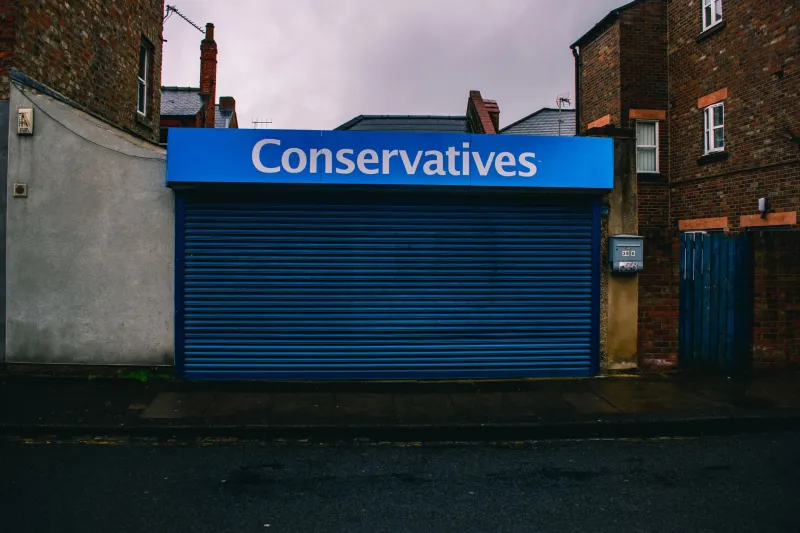
Walk down almost any high street in 2026 and you will see the same visual grammar repeated with minor variations: a warm, slightly grainy photograph of a smiling person in an apron; a hand-painted-style logo in a soft neutral; a shopfront mock-up so clean it appears to have been built in a laboratory rather than on a street with bins, bollards and a slightly uneven pavement.
None of this is necessarily bad. Some of it is rather nice. But a lot of it is beginning to look uncannily alike, and that is a problem for local businesses whose main advantage is being, well, local.
AI image tools have become extraordinarily good at producing the median version of a brand. Ask for 'artisan bakery, warm, British, independent' and you will get something that looks like every other artisan bakery, warm, British and independent brand that has ever been uploaded. The result is visually competent and emotionally flat. It looks like a place, but not a particular place.
The strange polish of somewhere that never existed
A real shopfront has evidence. There is a gutter. There is a faded notice in the window from three landlords ago. There is a bin that someone has moved slightly to the left. The paint is a little thicker where the frame was repaired. The sign has a tiny spelling quirk that the owner insists is intentional.
AI-generated shopfronts tend to remove all of that. They give you perfect lettering, even lighting, symmetrical windows and a pavement with no cracks. They produce a high street with the texture of a showroom. Customers may not consciously notice, but they often feel it. Something about the image does not quite commit to being real.
That feeling matters. Local brands run on proof: proof that you are nearby, proof that a person is behind the counter, proof that the place has survived a few seasons. A polished-but-generic image may look professional, but it does not provide proof. It provides atmosphere.
The telltale signs
The signs are not always obvious, and they are not a reason to shame anyone. They are simply worth knowing.
- Text that almost works. A sign that reads correctly at a glance but has a letter slightly out of alignment, or a date that makes no sense for the building.
- Uniform lighting. Every surface is evenly lit, with no shadow from the actual street, no cloud, no passing van.
- Hands and aprons. AI still struggles with the ordinary details of working life: the way a sleeve is rolled, the flour on a sleeve, the way a hand actually holds a loaf.
- Generic British cues. A chalkboard, a sprig of rosemary and the word 'artisan' do not make a place British. They make it a mood board.
- The same leaf mark. If your new identity features a single-line leaf, a hand-drawn sans-serif and a muted palette, you may be in a very crowded field.
- No context. The image could be Bristol, Bury St Edmunds or a business park in Reading. Nothing in the frame tells you where you are.
Why this is a brand strategy issue, not a design one
The temptation is to treat this as a technical question: which model, which prompt, which plug-in. But the real question is strategic. What are we actually trying to say, and what evidence do we have for it?
AI defaults to the average. If your brief is vague, the output will be vague with good lighting. If your brief is 'warm, local, quality', the tool will give you the average of every warm, local, quality brand it has seen. That average is not your brand. It is the category.
For a local business, the category is not the point. The point is the specific thing you do that the shop two streets over does not. The way you stack the window. The fact that you know a regular's order. The particular colour of the door that the landlord has refused to change since 1998. AI has no memory of your street. It only has a memory of the internet.
A simple test: the postcode test
Before you use an AI-generated image anywhere public, try this. Remove the logo. Show the image to someone who knows the area. Ask two questions: could this be us, and could this be here?
If the answer to both is 'yes, but it could also be anywhere else', you have decoration, not brand. If the answer is 'yes, that is clearly the shop by the church with the wonky step', you are getting somewhere.
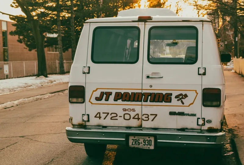
The test is not about technical quality. It is about specificity. A good local brand image should contain at least one detail that could only have come from that place: the actual view from the door, the actual van, the actual chipped tile, the actual dog that sleeps by the till. If none of those things are present, the image is doing a different job. It is making you look like a category, not a place.
Using AI without flattening the edges
This is not an argument for refusing the tools. We use them. They are useful for sketching, cropping, testing layouts and generating mood boards at speed. The problem comes when a sketch is promoted to a final asset without passing through the real world.
A practical approach is to treat AI as a sketchbook, not a stand-in. Use it to explore compositions, colour directions and typographic moods. Then translate the chosen direction into real photography, real signage and real materials. Keep a 'proof folder' of local details: textures, surfaces, the way light falls at 4pm in November, the actual street furniture. Brief a photographer with those details rather than with a generic mood board.
It also helps to use AI as a contrast tool. Generate the most generic version of your brand you can. Then ask what is missing. The gaps are usually the useful part.
The local advantage
In 2026, generic polish is cheap. Specificity is not. The businesses that will stand out are not the ones with the most flawless imagery. They are the ones whose imagery could not be mistaken for anyone else's.
A brand that looks like it could be anywhere is easier to forget. A brand that looks like it could only be here is harder to replace. That is worth protecting, even if the first draft came from a prompt.