The Pocket-Sized Shopfront: Making Your Brand Legible in a Screenshot
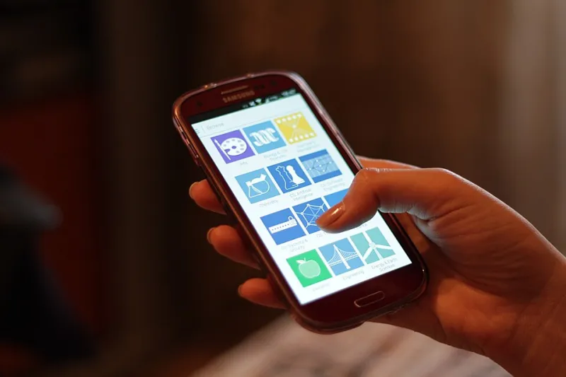
Photo: Océanos y dados, CC0, via Wikimedia Commons
A recommendation rarely begins with a website. It begins with a question in a WhatsApp group: 'Does anyone know a good plumber?' Within minutes, someone has replied with a screenshot, a profile photo and a phone number. By the time your homepage loads, the decision may already have been made. For independent UK businesses, the most important brand surface is often about 320 pixels wide.
That is not a reason to dumb down your design. It is a reason to design for the conditions people actually use. The group chat is not a lesser channel than the website. It is the pub table, the school gate and the village hall noticeboard, rolled into one digital space.
The screenshot economy is already here
Think about how local recommendations move. A neighbour asks for a dog groomer in the village WhatsApp group. A parent shares a bakery's weekend offer card in the school parents' chat. Someone forwards a mobile barber's contact details to a friend who has just moved to the area. In each case, the thing being shared is not your carefully written About page. It is a profile image, an offer graphic, a line of text or a copied phone number.
If those assets are muddy, cropped awkwardly or full of tiny type, your brand becomes a grey smudge. People do not zoom in to study it. They scroll on.
The thumbnail test
Start by shrinking your profile image to roughly the size of a thumbnail. Forty-eight pixels is a useful test. Can you still tell what it is? If your logo is a long wordmark, it may turn into a grey line. That does not mean the wordmark is wrong - it may be perfect on a shopfront - but it does mean you need a companion mark for small screens.
A simple shape works harder than fine detail. A bakery using a bold croissant icon will beat a photograph of its full shopfront at thumbnail size. A mobile barber using two high-contrast initials will be more recognisable than a delicate script logo. A dog groomer with a clean silhouette of a dog will read faster than a detailed illustration of a grooming table.
Not every brand needs a symbol. But every brand needs one clear, high-contrast shape that survives being viewed at arm's length on a phone.
Your offer card is a flyer in miniature
Offer cards, price lists and 'weekend special' graphics are made to be screenshotted. People forward them. They save them. They come back to them on a Tuesday when they finally need the service.
Treat these graphics like a flyer in miniature. The headline needs to be readable without a pinch-and-zoom. The price should be obvious. The date and location should be impossible to miss. The contact details should be real text somewhere in the post, not trapped inside the image alone.
A Christmas market stall in 2026 might have a beautiful poster, but if the date is set in 9-point type, it will fail when forwarded. Give the important information room to breathe. Use generous margins. Keep one clear action per card. If someone cannot describe the offer after glancing at a screenshot, the card is doing too much.
Contact details that copy cleanly
People copy and paste phone numbers. They screenshot addresses. They save websites. Make that easy.
Put your phone number, website and postcode in plain text in your captions and pinned posts. Do not rely on a graphic alone. Use a consistent format so people recognise it across platforms. A line like '07700 900123 | holmandesign.co.uk | M4 1HN' is not glamorous, but it is useful.
The same goes for your one-line description. 'Emergency plumber, South Manchester, 24/7' tells someone more in six words than 'Passionate about plumbing excellence' does in four. Local buyers need to know what you do, where you do it and how to reach you. Personality can come after that.
Trust signals at small size
Group chat recommendations carry social trust - someone known to the group has vouched for you. Your job is not to replace that trust, but to support it with small visual cues.
A single trust marker can help: a Food Hygiene Rating 5 badge, 'family run since 2012', 'fully insured' or a short review quote. Keep it to one or two signals. A cluster of badges at thumbnail size becomes visual noise. Consistency helps too. If your profile image, offer cards and pinned posts share the same colours and typefaces, a forwarded screenshot will still feel recognisably yours, even after it has been cropped and compressed.
A practical checklist
- Profile image: test it at 48 pixels. Use one clear shape, strong contrast and no tiny text.
- Name field: add your category and area where possible - 'Holt & Sons Plumbing, Leeds' is easier to search than 'Holt & Sons'.
- One-line description: service, area and one differentiator, ideally under fifteen words.
- Offer card: headline, price, date, location and contact. Keep a generous margin. Avoid small print.
- Contact block: phone, website and postcode as selectable text. Use the same format everywhere.
- Screenshot test: view your assets on a phone, screenshot them, send them to yourself and zoom out.
- Forward test: ask someone unfamiliar with your business to describe what you do from the image alone.
- Consistency: keep colours and typefaces aligned across profile images, offer cards and pinned posts.
Design for the smallest screen first
None of this means abandoning the website or the shopfront. It means accepting that the first click is often a thumb, not a mouse. The website is the second click.
A useful exercise is to build a small 'screenshot kit': a profile image that works at thumbnail size, a one-line description, an offer-card template and a contact block. Update it seasonally, especially for busy periods like the 2026 Christmas market season. Keep the master files tidy so you are not rebuilding from scratch every time.
At Holm & Design, we like design that works in the wild. A brand that survives being screenshotted, forwarded and viewed at arm's length is not a compromised brand. It is a practical one. And in a local group chat, practical is exactly what people are looking for.