Everything Looks Like a Farm Shop Now: Signalling Quality Without Joining the Beige Brigade
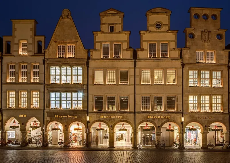
Photo: Dietmar Rabich, CC BY-SA 4.0, via Wikimedia Commons
Walk through the high street of almost any market town and try to tell the businesses apart without reading the signs. The deli. The dental practice. The financial adviser above the estate agent. The new coffee place. Off-white walls, one elegant serif, a muted olive or a soft sage, and a line drawing of a leaf. Everyone is signalling the same thing in the same way, so the signal is doing less and less work.
Call it the Waitrose effect: the widespread belief that restraint reads as quality. It's not wrong, exactly. It's just become the safest possible bet, and safety has a way of turning into sameness.
Why minimalism became the default
Four forces keep pushing brands towards the same aesthetic.
It's easy to approve. Muted palettes and generous white space rarely offend anyone in a meeting. Nobody has ever been sacked for choosing a nice grey.
It flatters cheap production. Restraint is forgiving when the photography is average and the paper budget is modest.
It borrows trust. The look is shorthand for institutions — galleries, banks, the better end of the supermarket shelf. Use it and some of that credibility rubs off, at least temporarily.
Everyone references the same moodboards. Designers look at the same handful of platforms, so the same references circulate, get refined, and eventually become the house style of several thousand unrelated businesses.
What that umlaut actually costs
The immediate cost is recognition. Distinctive brands have something you can draw from memory: a colour, a shape, a tone of voice, an oddly specific turn of phrase. If your identity is a competent arrangement of tasteful elements, there's nothing to remember and nothing to describe to a friend.
The second cost is more subtle. Quality signals are most convincing when they're specific, and specificity usually looks like detail rather than absence. Waitrose doesn't feel premium because its website is sparse; it feels premium because the same care turns up in the wordmark, the paper bags, the shelf edge labels, the staff, the car park. That's a discipline of consistency, not a palette.
There's a third cost that hits service businesses hardest. If you're an accountant, a solicitor or a design studio, people are hiring people. A cool, distant identity is a strange way to say "you'll enjoy working with us."
The trouble with trust signals
Minimalism in professional services often comes from a decent instinct: we want to look credible and unflashy. Fair enough. But credibility is a floor, not a ceiling, and a lot of firms have mistaken camouflage for confidence. A sans-serif logo and a grey website isn't trust. It's the absence of anything to distrust, which is a subtly different thing.
A framework we use: hygiene, signature, tension
When we're pressure-testing an identity, we split the work into three layers. They're not sequential, but they are different jobs, and mixing them up is where most brands go beige.
Hygiene. The trust signals you genuinely can't skip. Legible typography, consistent spacing, decent photography, accessible contrast, a phone number that's easy to find. This layer is non-negotiable and completely invisible when it's done well. It's the bit minimalism is good at.
Signature. One or two distinctive assets that you defend for years rather than seasons. A colour nobody else in your category uses. A shape. A pattern. A weirdly consistent way of writing headlines. Enough that a customer could describe you to someone else in a sentence.
Tension. One deliberate choice that carries personality and creates a small amount of friction — a photograph style that's slightly unexpected, a tone that's blunter than the sector norm, a layout that breaks the grid once per page. Not chaos. Just enough that the work doesn't feel generated.
Most brands chasing the premium look spend all their budget on hygiene and none on signature or tension. The result is technically correct and completely anonymous.
What it looks like in practice
In retail, the deli that stocks six local cheeses and writes the producers' names on the label is signalling quality more effectively than the one with a sage-green fascia. In hospitality, a café with three bold menu boards and an absurd hand-painted sign has more claim to character than a perfectly lit room of pale oak. In professional services, the firm that publishes plain-English explanations of awkward tax questions sounds more expert than the one quoting the aesthetic of a private bank.
None of that requires a bigger budget. It requires deciding which details you're willing to be specific about.
Words are the cheapest distinctive asset
Before commissioning anything visual, read your own website out loud. Cover the logo and ask whether the copy could belong to three competitors. If it could, no amount of considered typography will fix it. Specific words — a place name, a person's name, a plainly stated opinion — are the fastest route out of the beige, and they cost nothing but nerve.
A quick self-check
Cover your logo on your homepage and your social grid. Could this be three other businesses in your town? Does anything on the page name a real person, a real place, a real material? Can you describe your brand to a stranger without using the words clean, simple or premium?
If the answers are uncomfortable, you don't need a rebrand. You need one asset you'd defend, one specific thing to say, and the patience to keep saying it. Distinctiveness isn't loudness. It's the thing that makes you describable.