What a Well-Kept Boozer Can Teach a Digital-First Brand
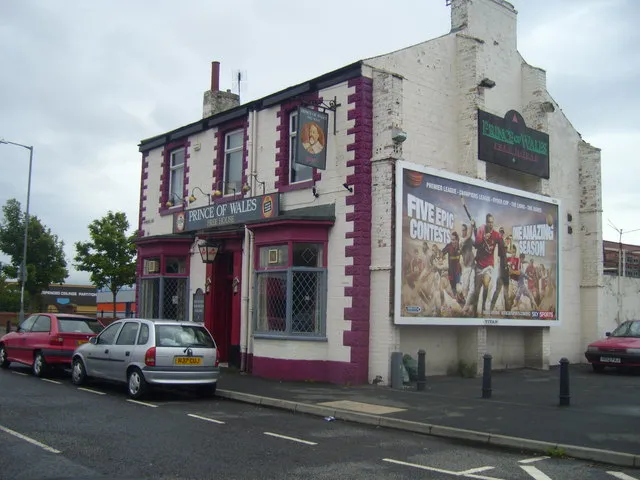
Photo: Ian Barton, CC BY-SA 2.0, via Wikimedia Commons
Walk down almost any UK high street and you will see a masterclass in compressed branding. Not the glossy kind. The working kind. A hanging sign, a painted fascia, an A-board on the pavement, a chalkboard by the door. None of it has much room. All of it has to perform in public, in bad weather, in a hurry.
That is the useful bit. Pubs are not interesting because they are old-fashioned. They are interesting because they have to be clear, memorable, and welcoming with very few assets. Digital-first brands, for all their pixels and dashboards, often struggle with exactly the same things.
Findable before fancy
A pub does not hide its name. It puts it on the fascia, on the hanging sign, sometimes on the wall, sometimes on the bin. The name is large. The descriptor is close by: Free House, Kitchen, Sunday Roast, Rooms. You know what it is and whether you want to go in before you have made a decision.
Many brands do the opposite. They put a clever wordmark at the top of a website and leave the explanation to a paragraph three scrolls down. Or they use a campaign line where a category should be. The result is not mysterious. It is tiring.
The lesson is not to make everything shout. It is to establish hierarchy. Name first. What you do second. Where you are or who you are for third. One clear next step. If a stranger cannot work out your offer from the top of your homepage, your packaging, or your shopfront, no amount of brand personality will fix the first ten seconds.
A name should do some work
Pub names are strange and practical at the same time. The Crown, The Ship, The Railway, The Red Lion. They tell you something about place, history, or at least what the sign might look like. They also survive being said aloud. That matters more than it sounds.
Digital-first brands often choose names that look good in a grid but are hard to recommend. If someone cannot tell a friend what you are called without spelling it, or cannot find you because the handle is taken and the domain is a variant, the brand is carrying unnecessary friction.
Try the pub test: can someone recommend you in one sentence? 'Try that place near the station, the one that does good coffee and a proper sandwich.' If your brand cannot be passed along like that, you may not have a name problem. You may have a description problem.
Typography is part of the welcome
Hand-painted fascias and chalkboard menus are not automatically good. Plenty are cramped, fussy, or impossible to read from the pavement. The good ones share a few qualities. They use contrast. They give the eye somewhere to land. They do not treat every word as equally important. They look like they belong to the building.
That is transferable. A brand that uses six typefaces, three weights, and a decorative script for body copy is not being expressive. It is being hard work. The same goes for a website that looks beautiful in a portfolio shot but makes the menu, the booking form, or the pricing page feel like a puzzle.
Good typography is hospitable. It respects the reader. It says: we have thought about how this will feel at the distance you are actually reading it from. On a phone. On a poster. On a chalkboard under a canopy in the rain.
Distinctive does not mean loud
A good pub often has one memorable detail. The sign illustration. The green tiles. The tiny snug. The landlord who remembers your dog's name. It does not need to be distinctive in every direction at once.
Brands get this wrong when they try to make every touchpoint a statement. Every social post needs a motif. Every email needs a mascot. Every page needs a new layout. The result is not distinctive. It is restless.
Pick one or two ownable assets and repeat them with confidence. A colour. A photographic treatment. A tone of voice. A shape. A way of writing headlines. Consistency is not boring when the underlying idea is good. It is what makes recognition possible.
The welcome continues after the sign
Signage gets you through the door. The room keeps you there. Light, layout, staff, menu, noise, seating. A pub can have a brilliant sign and still feel unwelcoming inside. The brand is the whole experience, not the paintwork.
Digital brands have the same gap. The ad is charming. The landing page is confusing. The checkout is cold. The confirmation email sounds like a parking fine. The sign did its job and then the room let it down.
So audit the whole route. If the homepage promises warmth, the booking flow should not feel like a tax form. If the brand is plainspoken, the terms and conditions should not suddenly sound like a different company.
A quick pub-sign test for your brand
Ask five questions of your main brand asset, whether that is a shopfront, a homepage, a pitch deck, or a packaging range.
- Can it be read from across the road, or across a crowded feed?
- Does it say what you are, not just who you are?
- Is there one distinctive detail someone could describe later?
- Does it sound like a person rather than a policy?
- Would someone feel comfortable walking in?
Good pubs are not brand museums. They are working rooms. They make choices that help people find them, read them, and settle in. That is still a useful brief for any UK brand in 2026, however digital the front door happens to be.