Bad Reception: What a Cold Village Hall Taught Us About Branding That Actually Works
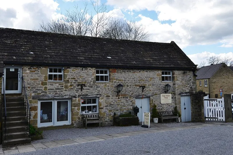
Photo: Michael Garlick , CC BY-SA 2.0, via Wikimedia Commons
There's a particular smell to a village hall in November: floor polish, urn-scale, and the ghost of a Christmas fair. We spent a Saturday in one last winter, helping a client run a stall, and it turned out to be the most useful day of brand testing we've had in years.
No signal. One plug socket. A trestle table with a wobble in one leg. And, crucially, a queue of people with time on their hands and no particular reason to be polite about your typography.
Why the hall is such a brutal test
Online, you get a flicker of attention and a back button. In a hall, someone stands in front of your table for ninety seconds, picks up a jar, turns it over, and asks you a question. There's no autoplay, no algorithm, no cookie banner. Just a person, a product, and whatever you happened to have printed.
If the answer to "how much is this?" involves a QR code, you've already lost. If the ingredients live only on the website, you've lost twice — once to the customer, once to the environmental health officer.
Everything that went wrong that day traced back to a single principle: a brand needs to hold up at the worst moment of reception, on the worst-printed surface, in the worst light. Most of our work is reviewed on a calibrated monitor at 100% zoom. Almost none of it is experienced that way.
Rule one: assume the screen is a rumour
The temptation with a small brand is to put everything digital and treat print as a calling card. That works right up until the moment someone is standing in a field with 4G that comes and goes like a bus timetable.
Put the price on the thing. Put the phone number on the thing. Put what it is, what's in it, and how much it costs on the thing. The website is for the people who already want to buy — the label is for the people who are deciding.
Rule two: contrast is a courtesy, not a style choice
We had a run of labels printed in a lovely warm grey on off-white. Beautiful in the studio. Under the hall's fluorescent tubes, at arm's length, by a man in his seventies, it was invisible. He asked his wife to read it. She couldn't either.
The fix wasn't a rebrand — it was a second colourway for small-format print. Same voice, more contrast. Legibility is not the enemy of taste; it's the price of admission.
Rule three: the weather is a stakeholder
Banners flap. Laminate sweats. Condensation forms on a jar of chutney the moment it leaves the chiller. Paper bags give up at the handle when they meet a bottle of elderflower.
None of this shows up in a PDF proof. All of it shows up on a Saturday morning in a car park.
The offline-first checklist
We now run this before anything gets signed off. It takes twenty minutes and saves a fortune in reprints.
- Body copy no smaller than 10pt at final size, and test it at arm's length, not on a laptop.
- Contrast checked in daylight and under warm tungsten — colours shift, and that pale gold will disappear.
- 300dpi minimum, CMYK, 3mm bleed, crop marks the printer actually asked for.
- Small text in 100% K only, so it doesn't pick up misregistration and go soft.
- Phone number, address and opening hours set as text, never as an icon alone.
- Nothing essential hidden behind a link or a QR code. If it matters, print it.
- Proof on uncoated stock as well as gloss — the same ink behaves completely differently.
- Run it through a photocopier and a greyscale printer. If it survives both, it's robust.
Signage
- One message per surface. "Open", the name, or the offer — not all three.
- Roughly 25mm of cap height for every 3m of viewing distance. Measure it, don't guess it.
- Eyelets every 500mm on outdoor banners, and remember wind is stronger at the corners than you think.
- A-frames weighted at the base and printed on both sides; a blank back looks like a mistake.
- Check whether you need advertisement consent from the council, plus landlord permission if you rent.
- Brand the back of the banner too. Half the hall sees the reverse.
- Opening hours that are true in January, not just in July.
Packaging
- Allergens declared on-pack in the required format and emphasised, not buried in a paragraph.
- Batch code and best-before date still readable after a spell in a chiller.
- Reclose instructions, because a bag that can't be resealed gets decanted into a tub and your name goes in the bin.
- Stickers tested against condensation, oil and a thumb.
- Weight or volume declared, and the unit price sorted if you're selling at scale.
- A label that still says something useful in a blurry phone photo taken by someone else.
What comes back with you
Oddly, the hall made the online work better. Once we'd stripped the brand back to what could be read at a distance, in bad light, by someone in a hurry, the website got simpler too. Headlines got shorter. Prices got clearer. The contact page stopped hiding behind a form.
Low-tech environments don't ask for a different brand. They ask for the same brand with the padding removed. If it works by the church gate in the drizzle, it will work on a phone on the train — which is where most of your customers actually are.