What 'Make It Pop' Actually Means: A Field Guide to Client Feedback
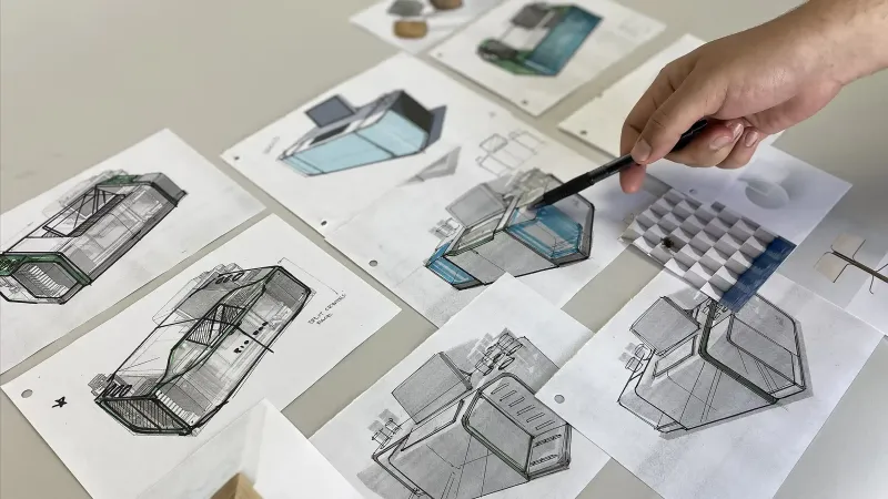
Photo: design studio client feedback review with printed designs and sticky notes, via www.studiored.com
'Make it pop' is not a design instruction. It is a feeling looking for a noun. In studio life, we hear it most weeks. It can mean more contrast, brighter colour, a bigger logo, a different typeface, or simply 'I am not confident yet'. The trick is not to guess harder. It is to build a translation habit.
Why vague feedback happens
Clients are not being lazy. They are often responding to a design in the only language they have: the language of effect. They know how they want the room to feel, not which grid to adjust. Designers hear 'pop' and reach for saturation. The client may have meant 'make the call to action impossible to miss'. Same phrase, different problem. Better feedback starts with better questions.
The translation table
Use this as a starting point, not a script. The aim is to turn a phrase into a decision, a constraint or a question.
| What they say | What it often means | Design response | Better question |
|---|---|---|---|
| 'Make it pop' | I cannot find the focal point | Increase contrast, reduce competing elements, give the CTA more weight | 'What should someone notice first, and what should they do next?' |
| 'Premium but approachable' | High quality without feeling exclusive | Use restraint in colour, generous spacing, warmer photography, plain-English copy | 'Which competitor feels too premium, and which feels too casual?' |
| 'Clean but not boring' | Simple structure, but with one memorable move | Keep the layout quiet; add personality in type, image or a single graphic device | 'Where do you want the personality to live: words, pictures or colour?' |
| 'Can we make the logo bigger?' | The brand feels under-confident or hard to find | Check hierarchy and brand presence; increase size only if it solves a real visibility problem | 'Is the issue that the logo is small, or that the page does not feel like you yet?' |
| 'Just something fresh' | The current work feels dated or familiar | Identify one specific stale cue: colour, type, photography, layout | 'What feels dated: the colours, the font, the photos or the overall shape?' |
| 'Can you tweak the colours?' | The palette is not doing the job it needs to do | Test palette against contrast, accessibility and print; adjust roles, not just hues | 'Should the colours feel warmer, calmer, more energetic or more premium?' |
| 'It needs more energy' | Pace, rhythm or visual temperature is flat | Add movement through scale, cropping, diagonal or brighter accent; avoid random decoration | 'Where should the energy sit: the headline, the imagery or the CTA?' |
Turn feedback into a shared vocabulary
The table is useful, but the bigger win is a ritual. Before a review, remind clients what decision you are asking for. Use a three-column note: keep, change, question. Ask clients to mark up the work with those labels. It sounds formal; in practice it saves a week of email. A studio that can say 'we heard premium but approachable and interpreted it as warmer photography and more white space' is easier to trust than one that silently guesses.
When 'make it pop' is actually the right note
There is a fair argument that clients should not have to learn design vocabulary. True. But they do need a way to describe intent. 'Make it pop' can be a useful starting signal if it is followed by 'because the launch date is the main thing'. The problem is not the phrase. It is the lack of a follow-up. A good studio does not shame the phrase. It translates it, reflects it back and gets on with the work.
A quick feedback routine
- Ask for one primary decision per review, not a general reaction.
- Use a simple prompt: 'What should this piece do first?'
- Reflect the brief back in plain English before you open the file.
- Separate taste from function: 'I do not like green' is fine; 'I cannot find the price' is urgent.
- Keep a living phrasebook for each client. Update it after every project.
The result is not just tidier feedback. It is confidence. Clients feel heard because their words turn into visible decisions. Studios spend less time decoding and more time designing. And 'make it pop' becomes what it always was: the start of a conversation, not a riddle.