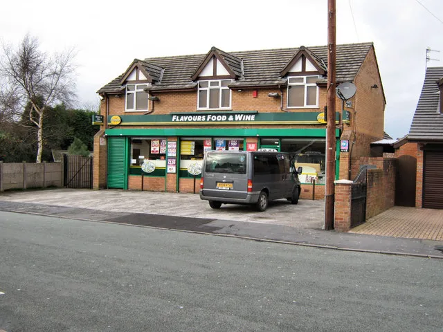
The Bin, the Van and the Gate: Designing Brand Details That Work Outdoors

Photo: Albert Bridge , CC BY-SA 2.0, via Wikimedia Commons
Walk down a residential street in almost any UK town and you can read a local economy in stickers. There is the wheelie bin with a crisp little logo near the handle. The white transit with a phone number that has faded to a ghost. The church gate sign held on with cable ties. The village hall noticeboard where a laminated A4 has gone the colour of weak tea.
None of these assets would make it into a brand guidelines PDF. They are too small, too grubby, too ordinary. And yet they are often the first and most repeated contact a neighbour has with a business. Before anyone clicks a homepage, they see a van parked badly outside the chippy. Before they read your origin story, they notice whether the bin sticker on collection day looks like it was designed or donated.
At Holm & Design we spend a lot of time on the big stuff — positioning, naming, the logo suite. But design thinking, made practical, has to reach the small stuff too. A micro-touchpoint is still a touchpoint.
Why the smallest asset often does the heaviest lifting
A homepage can be polished and persuasive and still feel abstract. A sticker on a bin is concrete. It turns up on the same day every week, in the same place, in front of the same people. That repetition builds recognition long before it builds affection.
There is also a trust signal in competence. A van with a clean, legible name suggests someone bothered. A gate sign that has been screwed on straight suggests the same. A bin sticker that has curled at the corner and collected moss suggests something else entirely — not a broken brand, exactly, but a brand that has stopped noticing itself.
Small outdoor assets are not about shouting. They are about being recognisable at a glance and credible at close range. That is a different design problem from a website hero, and it deserves its own rigour.
What outdoors does to a design
The outside world is a hostile editing suite. It crops, blurs, fades and interrupts. A design that looks sharp on a 27-inch monitor can turn to mush at four metres in November drizzle.
Four forces matter most:
- Distance. Most people will not stop to read. They will clock a shape, a colour and perhaps three words.
- Light. Flat grey skies reduce contrast. Low winter sun can bleach a surface. Wet tarmac reflects and distracts.
- Weather. UV fades ink. Road spray sandblasts lower panels. Jet washers find every weak edge.
- Motion. A van door is a moving poster. A bin lid is handled, dragged and stacked. A gate sign is read while someone is walking past with a dog.
Design for those conditions and the asset will do its job. Design for a tidy mock-up and it will fail politely, then embarrassingly.
A practical checklist for outdoor micro-assets
Use this as a starting point for bin stickers, van livery, gate signs, noticeboards, A-boards and anything else that lives outside your control.
1. Legibility at the distance that matters
Decide where the asset will be read from. A bin sticker is often seen at one to three metres on collection day; a van door at five to ten metres in traffic. Set a minimum text size and test it in the real spot, not on screen. If the brand name is the only thing people need, let the brand name be the only thing.
2. Contrast in bad light
Strong contrast is not the same as bright colour. Test the artwork in greyscale and in flat, overcast light. Dark text on a light background usually survives better than pale text on a mid-tone. Avoid placing key information over busy photography or dotted textures.
3. Durability by material, not hope
Choose materials for the surface and the season. UV-stable vinyl, proper laminate, stainless fixings, powder-coated panels. For van livery, think about panel recesses, door seams and road spray. For bin stickers, think about curved lids, handle movement and the likelihood of a jet wash. A cheap sticker that fails in six weeks is more expensive than a good one that lasts three years.
4. Colour contrast and neighbourhood recognition
Pick one recognisable colour or shape and use it consistently across small assets. This is not about a full logo system on a bin lid. It is about a visual cue that says 'that is them' before anyone reads a word. If your shopfront is deep green, your van door and noticeboard frame should not be bright orange unless you have a very good reason.
5. Placement and sightlines
Placement is design. A sticker on the sloping lid of a wheelie bin will be seen from above; a van panel is seen at an angle in a car park. Check the asset in situ at the time of day it will be seen. Avoid folds, handles, hinges and areas that get scuffed first.
6. Maintenance and ownership
Someone has to replace it. Write down who that is and when they check. A simple annual audit — before winter, ideally — catches faded vinyl, missing screws and the noticeboard poster from 2023 that is still pretending to be current.
7. Permission and common sense
Do not stick things on public bins, council property or other people's gates without permission. For parish noticeboards, follow the rules. For your own assets, keep it tidy. A micro-touchpoint is a guest in the neighbourhood, not a graffiti tag.
The neighbourhood recognition test
Here is a quick test you can run without a research budget. Take a photo of your bin sticker, van door, gate sign or noticeboard from the distance a neighbour would actually see it. Show it to someone who does not work for you. Ask three questions:
- Whose is it?
- What do they do?
- Does it look cared for?
If the answers are 'no idea', 'something to do with...' and 'a bit tired', the asset is not doing its job. If the answers are immediate, specific and quietly positive, you have a micro-touchpoint worth keeping.
Where to start this week
Pick the three outdoor assets your customers see most often. Photograph them as they are now. Check legibility, contrast, material condition and placement. Replace the worst one first. Then add the check to your annual brand audit, somewhere between the website review and the Christmas window plan.
The big brand suite still matters. But the bin, the van and the gate are doing the daily work. Give them the same design attention and they will return the favour in recognition, trust and the small, cumulative feeling that a business is paying attention.
That is design thinking, made practical — even at the kerbside.