The Familiar Face, Refreshed: Evolving a Brand Without Losing Your Regulars

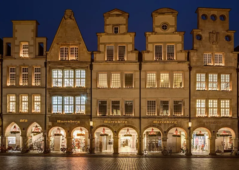
Photo: DiscoA340, CC BY-SA 4.0, via Wikimedia Commons
Most established businesses do not need a dramatic relaunch. They need a haircut, not a personality transplant. The café with a queue at 8.15am, the salon whose clients book six weeks ahead, the family shop that has outlasted three road layouts: these are brands with real equity, and equity is mostly made of recognition. Change too much, too quickly, and you risk making your most loyal customers feel like they have wandered into a stranger's premises.
A quiet rebrand is the alternative. It is not about hiding what you are doing. It is about changing in a way that feels like continuity rather than correction. The regulars should notice that something is smarter, calmer or clearer, but they should not spend the first week asking what happened to the place.
Why regulars notice everything
Regulars are not an audience. They are part of the ritual. They know which door sticks, which table gets the afternoon sun and which member of staff will remember their order. That familiarity is an asset, but it also means they read small signals closely. A new menu font is not just a font; it is evidence that something has changed. A different colour on the awning can feel like a verdict on the old one.
This is why the usual rebrand playbook can misfire in a local business. A big reveal, a countdown and a bold new 'us' work for brands with no existing relationship to protect. For a shop with regulars, the better question is not 'how do we make a splash?' but 'how do we move without making people feel unsettled?'
Start with an equity audit, not a moodboard
Before anyone opens a design file, list what makes you recognisable. Not what you like, but what customers use to find you and trust you. Call these your recognition assets. They might include:
- your name and the shorthand people use for it
- the shape or position of your sign
- one strong colour, even if it is slightly faded
- a typeface that appears on menus, bags or van doors
- a ritual, such as the way you display stock or write the daily specials
- the people behind the counter
- a product or service that regulars associate with you
Now make a second list: the fatigue points. These are the things that have genuinely had their day. Cracked laminate, a website that is hard to use on a phone, inconsistent menus, photographs from another era, a logo that no longer reproduces well on a tea towel. Be honest, but do not confuse 'I am bored of it' with 'it is not working'. The owner sees a brand every day. The regular sees it once or twice a week.
Our rule of thumb is simple: keep at least three recognition assets intact through the first phase. If you cannot explain why a regular would still recognise you after the change, you are not rebranding. You are replacing.
Phase it like a repair, not a reveal
A quiet rebrand works best as a series of small, coherent moves rather than one dramatic switch. Think of it as repairing a well-loved building: you might repoint the brickwork before you repaint the door.
Start with the practical layer. Fix the things that no one photographs but everyone uses: opening-hours signs, the website's contact page, menus, receipts, bags, appointment cards. This is where consistency does quiet work. By the time the more visible changes arrive, the business already feels more joined-up.
Next comes the soft layer. This might include social media avatars, interior posters, packaging stickers and small signage. Keep the old and new versions running together for a few weeks. Dual branding is not indecision; it is a handrail. It tells people that the place they know is still here.
Finally, do the public layer: the fascia, the main website, the van, the window graphics. Even then, leave one familiar anchor in place. It might be the old sign shape, a colour on the door, the same window display style or the handwritten notice board. Regulars do not need everything to stay the same. They need one or two clues that say 'yes, this is still us'.
The language matters more than the logo
A quiet rebrand is mostly a communications job. The mistake many businesses make is announcing a rebrand at all. The word invites opinions, comparisons and a vague sense that something has been taken away. Instead, announce a tidy-up.
Brief your team with plain language. Something like: 'You'll see a few changes over the next month. Same team, same hours, same coffee. We're just smartening things up.' That is not spin. It is reassurance. It also gives staff a script for the inevitable questions, which are usually friendly rather than hostile.
Avoid teaser campaigns, countdowns and dramatic before-and-after posts. If the old look was loved, the before-and-after format turns it into a contest. If it was not loved, the reveal draws attention to a problem most customers had not noticed. Either way, the drama is unnecessary.
Do not apologise for the old brand in public. You can be candid internally about what needed fixing, but calling the previous look tired or embarrassing is a strange thing to say to customers who have been loyal to it. Better to frame the change as maintenance: repairing, tidying, making things easier to read and use.
A small script for the counter
When a regular says, 'I liked the old sign', agree with them. 'So did we. We've kept the shape and repaired the lettering.' When they ask why you changed it, keep it practical: 'The old one was getting hard to read from the road, so we've made the name clearer.' If they say it looks different, you can say, 'It is a bit different, but the team and the opening hours are exactly the same.'
That last sentence does more work than any brand manifesto. It answers the real question behind most objections: am I still in the right place, and will it still do what I need it to do?
What not to do
Do not change the name unless there is a genuine commercial reason. Do not change your opening hours in the same month as your signage. Do not ask regulars to vote on logo options; that is a committee you cannot control. Do not replace every familiar cue at once. And do not make the rebrand the story. The story is the business: the bread, the appointments, the repairs, the service, the queue that still forms at 8.15am.
How to tell it has worked
The signs are subtle. Regulars keep using their shorthand for the place. New customers comment on how smart it looks. Staff stop apologising for the old materials. Footfall holds steady, and the feedback is about details rather than identity: 'The new menus are easier to read', 'I like the window', 'It feels brighter in here.' You want 'it looks smart in here', not 'what happened?'
A quiet rebrand is not the timid option. It is the confident one. It says you know what your customers value, and you are prepared to protect it while you move forward. In a country full of well-loved local businesses, that is usually the difference between a refresh and a rupture.